

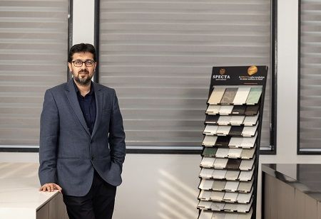
In an exclusive conversation with Homes India, Ankit Jain, Founder of Specta a quartz surface brand Specta, unpacks how Vastu Shastra is reshaping kitchen design choices across India.
As design literacy deepens among homeowners, Jain observes a growing demand for kitchens that are not just stylish and functional, but also spiritually aligned. From quartz innovations like the Pastel Poise collection to the potential for Vastu to become part of institutional design training, he shares how ancient principles are influencing modern material choices, especially in Vastu-sensitive spaces like kitchens.
Given India's regional diversity, how do Vastu colour preferences for kitchens vary — and how should design leaders adapt to those nuances?
So far, There’s not much significant regional variations in Vastu-based colour preferences for kitchens. The shifts we are seeing are more pan-India in nature, rather than region-specific. This is partly because the field remains unorganized and underexplored; there is no comprehensive body of research that maps regional nuances of Vastu-driven design. In spite of this, Vastu remains a vital factor for consideration in Indian architecture and interior design, and continues to be a major factor in decision-making for homeowners, influencing not only kitchen layouts but also colour palettes.
For design leaders, this opens up an important opportunity. By collaborating with Vastu experts and even conducting structured research into localised preferences, manufacturers, architects and interior designers can unlock valuable insights that guide product and design choices. This effort can help identify subtle regional distinctions.
Also Read: Kumari Nahappan explores colour as energy in new showcase
How has the industry’s understanding of Vastu-influenced kitchen colours evolved in the last few years?
The industry’s approach to kitchen colours has changed significantly in recent years, guided strongly by Vastu insights. For decades, black granite dominated Indian kitchens, largely because of its durability and availability. However, Vastu experts have long cautioned against using black in kitchens, associating it with negative energy. This has led to a gradual but noticeable shift. First, homeowners migrated towards white stones as a safer, Vastu-compliant option. Now, however, the market is witnessing an even more exciting transformation: a growing preference for softer colours like pink, green and pastels.
 This evolution reflects two key shifts. One, homeowners are more conscious about the emotional and spiritual quality of their spaces, actively seeking positivity and harmony through colour. Two, homes today are increasingly seen as personal sanctuaries where people can express their individuality through furniture, art or surfaces. The desire to move beyond white and experiment with colour is both a Vastu-driven and aesthetic-driven change. As a result, the industry is increasingly seeking expert guidance from Vastu practitioners, aligning innovation in materials and shades with principles that encourage balance and well-being.
Could Vastu-based colour guidance become part of institutional design training or industry standards in India?
Absolutely, it should be integrated in industry standards. For most Indian homeowners, Vastu Shastra is not a passing trend but a deeply embedded philosophy of space planning that influences both layout and material choices. As the design industry becomes more structured, it is only logical that Vastu becomes integrated into institutional training and even broader industry frameworks. Ignoring this aspect risks leaving out the lived reality of the majority of Indian customers, who actively seek Vastu guidance when making decisions about their homes.
We are already seeing strong customer demand for Vastu-compliant spaces. Today, a homeowner often consults an interior designer for style and aesthetics, and a separate Vastu expert for alignment. This may create inefficiency and, at times, confusion. A designer trained in Vastu principles would be able to deliver holistic solutions that respect tradition while keeping pace with modern aesthetics. Such integration would empower the industry to produce designs that are not only visually striking but also spiritually resonant.
Also Read: Hipcouch designs an elegant, functional, & Vastu-compliant Home in Bombay
How are data and customer insights influencing the way you approach colour choices in Vastu-sensitive spaces like kitchens?
For years, the industry was dominated by blacks and whites, but insights from homeowners and architects showed us that there was a growing appetite for colour, especially in Vastu-sensitive spaces like kitchens. Such market insights are crucial for home designing. Best example for this case is Spectra, which considered the increasing demand for the pastel quartz and launched Pastel Poise, India’s first pastel quartz collection. This launch become customers favorite leading to further expansion of newer shade launches in pastel red and pastel yellow.
Interestingly, our insights also reveal that the conversation around Vastu colours is no longer confined to kitchens. Homeowners are increasingly making Vastu-aligned choices for bedrooms, bathrooms and living rooms as well. This significant shift implies that Vastu is being applied holistically across the home, rather than selectively. This translates into immense potential for companies to develop colour solutions tailored to different rooms and energy needs.
By combining data-driven decision-making with the timeless wisdom of Vastu, one will be able to design products that meet modern aesthetic demands while staying aligned with what Indian homeowners truly value: harmony, positivity and individuality in their living spaces.
How do you see the role of Vastu evolving in the next 5–10 years, particularly as Indian homebuyers become more design-literate and spiritually conscious?
Vastu will grow from being a cultural preference to a strategic design component in Indian homes. Already, surveys show that a large portion of homebuyers actively demand Vastu-compliant layouts. This trend is driven by increasing awareness: people are more knowledgeable about how orientation, light, airflow, and even materials impact well-being, not just aesthetics.
As design literacy improves through social media, architectural content and accessible rendering tools, homebuyers will expect homes that balance modern design with spiritual harmony. They will look for homes with entrances facing auspicious directions, kitchens placed in Vastu-recommended zones, and rooms aligned to capture natural light and positive energy.
We also anticipate more synergy between Vastu and material science: surfaces, colours, stones, finishes will be evaluated not only for durability and aesthetics, but also for how well they comply with Vastu’s guidelines—whether it’s colour tones, placement of surfaces, or how light reflects off them.
For example, Specta’s pastel tones, are chosen not just for visual comfort but also for emotional resonance, which aligns well with Vastu sensibilities. Vastu will become less of an add-on or afterthought, and more of a foundational part of the design process—for both builders and homeowners.
Also Read: How Hues Shape Feelings and Perspectives: The Emotive Power of Colour in Photo Imaging
What advice would you give to homeowners who want to incorporate Vastu-aligned colours but also follow global kitchen design trends?
My advice to homeowners is to view Vastu and global trends not as opposing forces, but as complementary ones. Vastu traditionally associates certain colours with positivity in specific zones—for example, shades of blue for the northeast to enhance growth and calm, or silver and greys in the southeast. At the same time, global design is moving towards softer palettes, biophilic elements, and pastel tones that promote serenity and mindfulness.
This is where quartz surfaces offer a unique advantage. As mentioned before; by opting for Specta’s collections like Pastel Poise, homeowners can integrate Vastu-friendly shades like lavender, green, pink and blue while keeping pace with international design sensibilities. These stones not only satisfy spiritual alignment but also deliver on durability, stain-resistance and NSF-certified hygiene, which are non-negotiable in modern kitchens.
Ultimately, designing a beautiful home is about striking the right balance. Use colour to align with Vastu, but apply it in modern ways through countertops, backsplashes or islands that make the kitchen both spiritually harmonious and aesthetically cutting-edge.
We use cookies to ensure you get the best experience on our website. Read more...
Copyright © 2026 HomesIndiaMagazine. All Rights Reserved.
